For a recent text analytics project, I took a look in a deep, dark corner of the Internet... at the one and only Craigslist Missed Connections. For those unfamiliar with such shenanigans, Missed Connections are a sort of social platform for folks that had some sort of encounter with a stranger that they were interested in, but never exchanged contact information with. I took a stab at estimating the sentiment of posts and then attempted to cluster them to try and get a sense of some of the main themes within the posts. Below is an example post, with all of the available information associated with a Missed Connection:
Bank Official - m4w - (Reston)
Just wanted to say you're stunningly beautiful :) I was at your banking center in Reston. I was in a counter when you walked in and we looked at each other and said Hi. Wish there was a chance for a longer conversation! (Oct 15th morning and it was raining)
9:51pm October 16, 2014
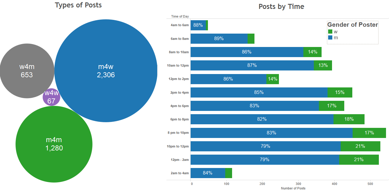
In the above example we have the title of the post (Bank Official), the type of post (m4w), the location (Reston), the body of the post, and the date/time that the post was submitted. The title and body of the post are just raw text, but the post type (m4w) stands for man-for-woman, meaning a man submitted the post and the person he is interested in trying to find is a woman. In addition to m4w, other post types include m4m, w4m, w4w, etc. I chose to focus my little experiment on the East coast and, in particular on the following six cities: Boston, New York City, Baltimore, Washington DC, Raleigh, and Charlotte. In total I looked at about 4,500 posts. These posts ranged in length from just a handful of words, to what seemed like poorly written novellas. Below shows some summary info on the number of posts we collected, the types of posts, gender of posters, and when they posted.
PART I: Sentiment Analysis
Using the ANEW Python package I was able to estimate the sentiment of the missed connections on a 2 different scales: arousal and valence. While use of the term 'arousal' might lead you to believe that I looked at how sexually explicit these texts were, arousal in this sense is focused on the level of excitement within a post. The valence score was used to show how pleased a body of text was. So, for example if a post had a high valence score and a high arousal score, this could be translated to an emotion such as ecstatic. On the other side of the scales, low valence and low arousal could be more in the ballpark of depressed.
Below you can check out the scores of the posts with some options to filter some of the data. Blue dots are posts written by men, green are written by women. The size of the posts is the "total variance" of the post. The way the ANEW package scores sentiment, is to individually score words within a post. There are obvious drawbacks to this, most obviously, the fact that a lot of context is lost when looking only at individual words... but it's better than nothing. So the "total variance" of a post is just the sum of the variance in word-scores on the arousal scales and the variance of the word scores for valence scale. It was an attempt to find posts that might have been average in valence and/or arousal, but had high variability, indicating they contained a couple of words that were very extreme. Unfortunately, it became clear quickly that the sentiment of these posts is just very similar. I tried slicing by location of the post, gender of the poster, gender of the person being posted about, time of day the post was written, etc... and I couldn't see significant differences in the sentiment of these posts. And there went my theory that late night posts would be sad and depressing while daytime posts would be more optimistic and happy. Such is life.
Below the sentiment scores of posts are the most frequently used words within posts (relative frequency indicated by the size of the bubble), with their associated sentiment scores. Hopefully this gives you an idea of what words are in the ANEW dictionary that were scored to create the overall sentiment scores for posts.

PART 2: Cluster Analysis
While sentiment analysis turned out to be mostly futile, I did experience some success in clustering posts. Using SAS Enterprise Miner, I was able to come up with the following six clusters:
| Cluster | Descriptive Terms | % of Posts |
|---|---|---|
| Cluster #1 | Shirt, short, smile, train, wear, black, blue, brown, hair, white, color, beautiful | 20% |
| Cluster #2 | Parking lot, car, drive, park, driving, gas, kind, color, turn, leave, white | 5% |
| Cluster #3 | Day, feel, good, happy, heart, life, love, miss, thing, want, always, year | 20% |
| Cluster #4 | Chat, hear, hope, meet, number, shot, talk, friend, long, night, know, chance | 30% |
| Cluster #5 | Interest, nice, guy, afternoon, check, hit, hot, white, today, look, great | 9% |
| Cluster #6 | Make eye, eye, hit, hot, time, contact few, couple, man, sexy, today, work | 16% |
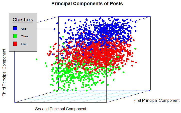
The three clusters with the largest percentage of the posts within my sample set are clusters 1, 3 and 4. I think these are pretty good representations of some of the topics that In saw anecdotally when manually looking through some of these posts. The first cluster is about physical description -- the colors appearing in the important terms are likely hair or eye color, words like "smile", "beautiful", and "wear" speak for themselves. The third cluster is clearly an emotionally focused topic. The words are largely centered on the emotions felt by the poster, presumably when they encountered this stranger they now are hoping to connect with. Finally, the fourth cluster appears to be focused on the communication aspect of these posts. Many of these posts deal with situations where individuals had a chance to talk to each other, but failed to get contact information before parting ways. Words like "chat", "talk", "chance", are indicators that the posts are describing these encounters where communication did occur.
Clusters are calculated using singular value decomposition, a process that essentially looks at terms and even combinations of words in order to virtually plot each post on a multi-dimensional set of axes that, when combined, represent all of the words found across all of the posts in the data set. The key, is that these axes are created in order, in order of the amount of variability they help to explain within the posts. While the topic itself is difficult to explain, the important aspect is that these created axes with which posts are now plotted on are created in order by the amount of variability they explain. In other words, the first axis is the best at separating out posts by type. Below, I've taken the first three axes that result from singular value decomposition and plotted the posts that fall within the clusters 1, 3, and 4. You can see how they are really separated!
comments powered by Disqus